We're proud to introduce an advanced meteorological function to Stormsurf - Significant Wave Height measurements taken from the Jason-1 satellite overlaid on the Wavewatch III wave model. This represents the state of the art in altimetry visualization for a unrestricted public forum. We hope you are able to make full use of this powerful tool and recommend reading the information below to help make the most of this resource.
Overview
The Jason-1 satellite was launched 12/07/01 from Vandenburg Air Force Base on a mission to collect detailed sea surface topographic data. It's primary goal is to map the oceans surface and determine deviations from normal seasonally adjusted baselines to determine the presence of El Nino or La Nina. This measurement is call Sea Surface Height Anomaly and is accurate to within 4.2 centimeters. The satellite has an instrument known as an altimeter that directs a thin radar beam at the ocean then measures the time shift of the signal reflected off the ocean to establish deviations from a 'normal' sea surface height. From this Significant Wave Height can also be calculated. In addition Jason-1 also measures Wind Speed, Satellite Altitude, KU-band ionosphere correction and more while providing basics like Time, Latitude and Longitude. The assimilation of this data provides a powerful tool for determining the state of the ocean at specific locations nearly real-time. Typical lag times are about 2-3 hours. The satellite follows a polar orbit - that is the satellite orbits over the north and south poles, essentially a north-south circle while the earth rotates under it. Radar pulses are sent earthward providing a measurement opportunity about every 0.05 degrees along the satellites orbital track, or about every 3 nautical miles. The data is accumulated in the satellites computers then relayed about every hour to a satellite based communication network and directed to earthbound computers. The data is processed and then posted for scientific analysis. Through a United States government funded ftp site set up to disseminate Jason-1 data, Stormsurf picks up the data and performs processing specific to our needs, posting the results for all to view. As best we can determine Stormsurf is the only site providing full globe coverage to the public for free.
How Does This Data Relate to Surf Meteorology?
When Jason-1 Significant Wave Height data is overlaid onto the Wavewatch 3 wave model (WW3), one can determine the accuracy of the wave model. That is, contrary to layman opinion, the Wavewatch III wave model is not always accurate. That is not to say it is grossly inaccurate, but typical of any computer model, it is an idealized simulation of reality, and not reality itself, and it therefore subject to deviations from what is occurring in the real world. Also consider that the WW3 wavemodel is really a model using another model, namely the GDAS wind model, as it's source. That is, it's a model of a model. This increases the probability for accumulated error and drives the need for real-world verification. To the WW3 wave models' credit, most instances of deviation are subtle. But to generate the most accurate surf forecast possible, this is an essential tool for pushing the state of the art. As such, this tool is a bit esoteric for the average user, but a key element in the arsenal of technology used to create accurate surf forecasts and is applicable in other scientific pursuits.
Data Limitations & Expectation
As you can see the width of the radar beam is quite narrow, limiting the coverage of the data during any 6 hour period (see figures below). It's really hit-or-miss whether the satellite will pass over the core of a storm of interest at any point in time. But this is to be expected since the real mission of the satellite is to map El Nino-La Nina anomalies accumulated over a multi-day time spans rather than real-time collection of very targeted and narrow scope Significant Wave Height events. So we have to accept that the satellite may not pass over all areas for all time periods. Because we are using the quickest available Jason-1 data source, only gross error checking is performed on the data so the altimetry data is inherently 'noisy'. There appear to be 2 types of noise: 1) Noise within storm centers themselves and 2) Noise generated as the satellite reaches ice and land boundaries. Addressing item #1: There is significant variation in individual Significant Wave Height readings as the satellite tracks over areas of high seas. At first we were thinking this was a data error, but then we came to realize that we've become too accustomed to the idealized wave height estimates the wave models provide. In reality, in the core of a strong fetch, seas will be inconsistent as large wind driven waves interact with one another, grow and ebb in the frothy turmoil of the core of a storm, and the data clearly reflects that. Wave Heights from 3-4 consecutive readings can vary over a broad range, and it's best to take the average of the raw data points to determine the actual seas state. Remember, over any 1 hour period, individual waves can be up to 2 times the height of the significant sea height (average of the highest 1/3 of all waves in the fetch). That is, if seas are 30 ft, it would not be uncommon to see one wave to 60 ft. Nearshore noise is a different issue and is likely a case of bad data.
To deal with this, we analyze a variety of 'quality flags' imbedded in the bit stream to try and determine the validity of every reading. Factors such as altimeter quality flag, altimeter state flag, orbit state flag are decoded and reviewed. Additionally flags for surface type, altimetry echo type and significant wave height sigma values are analyzed. But even with those set to their strictest limits, much noise still seeps through. In past incarnations of this product we just posted the value of every 15th raw data reading after all the quality checks. We've now modified our approach (6/3/07), and maintain a running average of the valid data points and post that value every 15-50 measurements along the orbit track along-side of the colorized raw data (averages are posted every 15 measurements for the local charts, every 20 measurements for the hemispheric charts and every 50 measurements for the global images). We then keep a running log of the highest average wave height posted when building a chart, and annotate that at the bottom of the chart as 'Max Average Measurement'. Additionally we keep a running log of the highest individual significant wave height encountered while building a chart, and post that value as the 'Max Measurement' (at the bottom of each chart). For the individual measurements we exclude those further north or south of 60S/N, limiting the probability of coming near sea-ice boundaries. If all goes well, you can view the highest average reading (and it's coordinates, measurement date/time etc) and then view the highest individual reading within that grouping (more info below). But of course sometimes they don't sync up and the highest individual reading is located somewhere else on the chart. When this occurs it's normally due to noise in the data and is a bad reading near a land/sea interface.
But otherwise all available altimetry data points are plotted and scaled in the color scheme selected.
When I look at One of the Charts, What Am I Seeing?
For the most part what you see is what you get (WYSIWYG).
The WW3 wave models 00 hour verification image for say the 06Z run of the model is archived. As data streams off the Jason-1 satellite we download, preprocess and sort it. All altimetry readings that are within 3 hours of 06Z (that is all data points from 03-09Z) are accumulated in a file and then overlaid onto the 00 hour slice of the 06Z run of the model. In this way only the altimetry data that is near in-time to the corresponding WW3 model are charted. The color scale used to plot both WW3 Significant Wave Height and Jason-1 Significant Wave Heights are the same. Little red dot's are used to define the rough boundaries of the Jason-1 data. So If the model is in close agreement to reality, the colors within the Jason altimetry track should match the colors produced by the wave model outside the altimetry track. Where there are significant deviations, the colors along the altimetry track will be different than those suggested by the model, either higher or lower. Bear in mind that virtually every single data point coming off the satellite is overlaid onto the wave model. That is one data point every 3 nmiles! If you're only looking at the Global images (at the top of the menu page) your missing the good stuff because the individual data points bleed together providing a nice overview, but not much else (see images below). But as you drill down into the hemispheric and regional images, the fidelity of the individual satellite data points starts appearing, and the variation from one reading to the next become apparent. Pretty cool!
A tag or flag is posed next to the Jason data periodically to indicate what the actual Significant Wave Height reading is (rounded to the nearest who digit). Over time you'll develop skill at knowing which images to use for what purposes, and what data points to exclude and what to include in your analytical pursuits.
 -
- 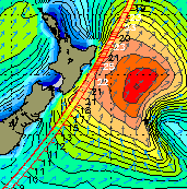
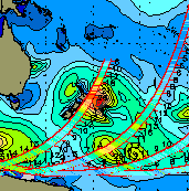
Two Extremes: Global View (left) and the zoomed-in Regional View (right): Notice that the global view, while providing a good indication of where the satellite has been and a rough idea of what the sea heights are in any given region, gives no detail. Conversely the Regional View enables inspection of individual satellite measurements. If you look closely you'll see a small while (light purple) line in the altimetry path just northeast of the northeastern tip of New Zealand. This is not an anomaly but indicates a single wave height of 30 ft. The other data points in that area seem to indicate that seas are in-fact higher than what the wavemodel suggests should be at that location, meaning that more swell might be in the water tracking north than what is modeled.
What Charts are provided and What is the Difference?
There are three levels of images constructed: Global, Hemispheric and Regional. The Globals provide a overview to indicate where the satellite has been (or what data is available) and what the overall Significant Sea Height state is. The hemispheric images take it down one level and set you up to know which regional image to select. The Regional images are where the real meat is, allowing inspection of individual altimetry datapoints, to determine how close the wave model really is to reality. Altimetry readings higher than what is suggested by the wave model indicate the resulting swell could be higher than what the model suggests. The inverse is also true.
Also the density of the flags increases as one drills down, from a flag every 50 datapoints for the global, to one every 20 for the Regional's.
What is 'Max Measurement' and 'Max Average Measurement' Posted at the Bottom of Each Image?
If you notice, at the bottom of each image is some text that indicates what the largest Jason-1 Significant Wave Height reading that was found for the entire dataset overlaid on the image. The Max Measurement is the largest single reading found on that dataset (in ft), plus the latitude, longitude, time and date of that reading. It is recommended that this reading not be used in isolation, but that it be compared to other reading in the area to se if it 'fits' (makes sense). Additionally we keep a running tab of the maximum average height found on the chart (an average of either 15, 20 or 50 contiguous measurements). Some data is excluded from this calculation as previously discussed in the Limitations Section. If the 2 data points for the Max Measurement and Max Average are in close proximity to one another, then you have a pretty good sense of what the range of wave heights are in the area. In the sample below, the average wave height was 22 ft near 46S 144E with one rogue wave to near 32 ft.For wave forecasting purposes use the average figure through (22 ft).

How often is the Data Updated - What's the processing cycle?
At a high level new data is retrieved about once every 6 hours (4 times daily) with a final last catch-up run occurring right prior to the end of each day (right before the 00Z run of the WW3 posts to the ftp server). Animations are updated only at the end of the day in the catch-up run.
At the lower level things are a bit more tricky. The scripts are set up so that once every hour we check to see if we've received a new WW3 grib (the source dataset for building the wave model charts). If we have received a new grib, we then retrieve all new altimetry data (regardless of what time it is for. Any data not previous received is captured). The altimetry data is sorted and then overlaid on not only the current chart but all previous charts constructed that day. A day starts at 00Z and runs to 18 Z (There are 4 cycles/day: 00, 06, 12 & 18Z). So if we're processing the 12Z cycle, we rebuild the 00 and 06Z images too and include any new altimetry data not previous posted. This ensures that if for some reason not all satellite data was available in a previous run, or the data was only partially available for the request time range (fairly common), we are then able to catch up and provide the complete dataset. Once the WW3 grib for that time period is processed, no additional processing is accomplished until the next new grib is posted (in our example the 18Z). So this typically results in no activity for about 6 hours between each cycle. Each cycle takes about 30-45 minutes to construct. So updates are posted roughly as follows: 00Z at 6:30Z , 06Z at 12:30Z, 12Z at 18:30Z and 18Z at 00:30Z.
There is one final 'wrap-up' run that starts at 4:45Z to capture and depict any altimetry updates to the 18Z image, and any other previous images not fully populated with available altimetry data. In this run, the final images for the day are copied to an archive (which contains a weeks worth of previous images in chronological order) and then a Macromedia Flash animation is constructed. So the animation only has current data after this run. In all subsequent runs, the most current data can be obtained only from the static images available on the menu.
We hope you find this data informative and useful as you pursue scientific and recreational explorations.