Weather is a highly dynamic physical process, to make a gross understatement. That is, everything that occurs in the atmosphere and at the ocean's surface of can be attributed to the interaction of competing forces like pressure, wind, and equilibrium. Since these forces are physical, they can be mathematically described. Forecast models attempt to predict weather using the following premise: If you can describe the current state of the atmosphere, and if you can mathematically represent all the interactions that occur in the atmosphere, then you should be able to predict the future state of the environment. In theory the process seems fairly straight forward, but the devil lies in the details. The forecast model business is a never-ending game of trying to improve both the equations that describe atmospheric interactions and the processes used to gather data about the initial state of the atmosphere. Add in chaos theory, and, over time, even the slightest miscalculation or deviation from reality leads the forecast to deviate from actuality. But, forecast models have dramatically improved over the years, due to tremendous leaps forward in both computer technology and forecast methods. It is now possible to construct a fairly accurate detailed representation of the atmosphere up to 4 days in the future, with some running out to a week ahead with limited success. And sea surface temperature models can run out to a year in the future.
There are many types of models used by surf forecasters including: large scale models, local models, short term and long term models, atmospheric models, sea surface temperature models, and wave models, just to name a few. Atmospheric models, as their name indicates, forecast the state of the atmosphere and are the subject of this section. Atmospheric models produce a series of images depicting the state of the atmosphere at various points of time in the future. Some of the better known atmospheric models include the RUC (predicts weather in 3 hour increments out to 12 hours, ETA (predicts in 12 hour increments for 48 hours), AVN (predicts in 12 hour increments out to 72 hours) and NGP and MRF (12 hour increments to 7 and 10 days respectively). But it's not so much the forecast these models produce that interest us here, but the initial state of the environment. Extremely detailed observations about current weather conditions are gathered, fed into the models, and used as the starting point for the model forecasting process. The first image produced by a model is called an "Analysis". It is a graphic representation of the current state of the environment and is the starting point or basis for the forecasts. This image is of prime interest to surf forecasters.
The environment can be viewed from many different perspectives, depending upon your interest. Some people are interested in temperature, others in humidity or precipitation, wind, pressure or vorticity. And all these aspects of weather are different depending on their elevation. Weather is different depending on its height in the atmosphere. Just look straight up next time you're outside. Under the right conditions, you'll notice some clouds moving east to west while others higher up moving west to east. That means the wind blows from different directions depending on its height in the atmosphere. Absolute height (in terms of feet above sea level) isn’t how the models depict elevation either. Rather, a standard set of pressure levels is used as the reference point. For example, you'll see images that describe weather at the surface, 1000, 850, 700, 500, 300 and 200 mb levels. The surface forecasts are at sea level pressure, and the 200 mb level is where the average air pressure is 200 mbs, or up at the jetstream level (around 30,000 ft). Conditions at higher elevations (500 mb and up) tend to act as leading indicators for what's to come in the future at the surface. The reason for making this point is, though the models contain a wealth of information about weather from many different perspectives, the perspective surf forecasters are mainly interested in is the one which interacts with the oceans surface to make waves. In short, surface level analysis is where it's all happening.
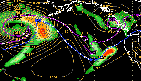
There's two images that depict conditions that surf forecasters are interested in: Surface Sea Level Pressure (SLP) and Surface Winds. Such images are normally labeled 'Analysis' or '00hr Analysis' when viewed on the Internet. There normally is one image that depicts location of low pressure and high pressure systems (surface pressure), while another indicates wind speed and direction that in-turn can be used to determine fetch area (surface winds). But how do you read these maps? Let's discuss the surface pressure image first. Using the example below, you'll see parallel lines, and some that sort of join to form rough circles, and numbers associated with each circle. The lines depict areas of equal pressure and are called isobars. The actual pressure for each isobar is indicated in term of millibars (mbs). If you notice, as you move your eye from the outer ring towards the inner for any set of isobars, the pressure either increases or decreases. Increasing millibar numbers/pressure means the set of circles is depicting a high pressure system. Decreasing numbers indicate low pressure. The innermost circle represents the lowest or highest pressure at the core of the system.
Wind circulates almost perpendicular to the isobars around high and low pressure systems. In the north hemisphere, wind moves clockwise around high pressure systems, and counter clockwise around low pressure systems. The directions are reversed in the south hemisphere. So, in the northern hemisphere, if you spot a low pressure system, generally one can conclude the winds around this system are flowing counter-clockwise around the core, or from north to west to south to east, with a slight angle towards the center of the storm. High pressure systems rotate in the opposite direction, with a slight angle outward from the center. That is, air flows into low pressure systems (like water down a drain) and it flows out of high pressure systems (like water out a hose). As previously mentioned, the deeper the low (the lower it's millibar reading) the stronger the storm and the stronger the winds are around it. So a low pressure at 956 mbs is much stronger than one at 980 mbs, and has much stronger winds associated with it. Surf forecasters like to review surface pressure analysis images to confirm the existence of storms initially viewed in satellite images. The storm's location is plotted and it's distance from shore calculated. Though a satellite image indicates that a storm has potentially formed, a surface level pressure map helps confirm its presence at the ocean's surface.
 |
Winter Pattern
Notice the deep low over the Aleutians with central pressure at 960 mbs. A weak high to it's southeast has a pressure of 1024 mbs. Another weak low is situated off the Canadian coast with pressure at just under 1000 mbs. The red and orange areas depict rain. Surely very strong winds are blowing genrally west to east in the southern quadrant of the storm over the Aleutians, towards the Western US coast.
Image Courtesy: FNMOC
Now that we know a storm has indeed formed, what other information do we need? This is where a surface wind analysis map becomes useful. It depicts current average estimated wind speed, direction and areal coverage. In short, this image is key for identifying and analyzing potential fetch areas. Winds are indicated using a symbol called a 'wind barb'. It looks something like this:
North
West |
\_\____ |
East |
| |
tail -shaft |
|
South
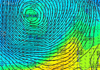
The barb has a shaft and a tail. The shaft tells the direction the wind is heading, the tail tells its speed. A full tail is normally equal to 10 kts. Half a tail is 5 kts. Two tails equals 20 kts. If the tail is thick (and looks like a flag) it's called a 'flag'. A flag indicates wind speed of 50 kts. The tail(s) are attached to the shaft on the end the winds are coming from. The part of the shaft opposite the tails is the direction the winds are heading towards. In our example above, the barb indicates winds are heading from west to east at a speed of 20 kts. If there are many wind barbs on a map present next to each other, they all indicate wind speeds of 30 kts or greater, they're all aimed in the same direction and covering a fair amount of ocean surface area, then one can presume a fetch area is becoming established. If the barbs are pointing towards your beach, that is even better. This means the fetch area is aimed at you! If it's not aimed at you, then the probability for a swell heading towards you drops, no matter how close the storm is to your beach. If the map is detailed enough, one can even determine the coordinates (latitude and longitude) for the start, end and width of the fetch area, and calculate it's areal coverage. Remember, the larger the fetch area aimed at you, the better.
 |
Wind Barbs
Notice the high concentration of wind barbs indicating speeds of 30-40 kts in the West and South quadrants of this storm. They indicate the wind is blowing towards the southeast and east, normal for low pressure systems in the northern hemisphere
Image
Courtesy: University of Washington
Transparent model images of both surface pressure and surface winds are often overlaid onto satellite images. When viewed in this way, both visual and technical perspective of a storm can be examined simultaneously. With practice, you'll begin to notice that wind speed is proportional to the central pressure of the low that's generating the wind. The deeper the low, the stronger the wind, and the greater the probability for swell development.
IR Satellite Image with AVN Surface Pressure and Wind Model Overlay
This image is from the Southern Hemisphere, with New Zealand just barely visible to the lower left. A 1028 mb high pressure system is centered over the lower half of the image, with winds from 10-25 kts circulating counterclockwise around it, normal for this hemisphere.
Image Courtesy: University of Hawaii/SOEST
For the most part, we've discussed waves as if they were produced by a single storm that was not interacting with any other weather feature. But in reality, it's the interaction of a low and high pressure that make the best swells. Storms are typically associated with high velocity but gusty winds. That is, winds that vary slightly in speed and direction from moment to moment. Though such winds are quite capable of creating large waves, ideally, a better set-up exists. High pressure systems are known for being stable. At the core of a high pressure system, the wind is calm, and weather is fair. But around the perimeter, winds can be brisk as they interact with competing low pressure systems. Though not comparable to a good storm, the wind associated with high pressure has a redeeming character: it's steady and consistent in both direction and speed. Such wind can make waves, though typically they're small. But when high and low pressure systems interact, they produce high velocity steady state winds, a prized swell generating combination.
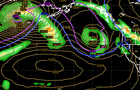
But first, let's discuss some basic theory. High and low pressure systems cannot merge. If anything, a high pressure system repels a low. Instead, low pressure tends to migrate around the edge of a high. But sometimes the atmosphere gets arranged so that lows and highs have to interact. As they approach each other, the difference in pressure becomes more pronounced. Air starts moving from the high towards the low at a greater rate in an attempt to establish equilibrium. The closer they get, the greater the pressure difference, and the greater the need to establish equilibrium. Graphically, this situation is represented at the surface by the isobars in each system getting compressed together. The tighter the isobars are together, the higher the wind speed. This is what we call a 'gradient'. And the wind in a gradient is not only strong, but steady, and this dramatically increases the probability for swell development. Surf forecasters get real interested when a strong gradient is either forecast or has developed and is aimed towards their shores. Such conditions show up well on surface and wind analysis charts, and are clear on SSM/I imagery. The resulting seas are also apparent on ERS-2 sea height charts.
 |
Mild Gradient
Notice the very deep 952 mb storm over the Aleutians with a strong 1032 mb high to it's southeast. Though the systems are not very close, some amount of 'gradient effect' is undoubtedly occurring. If the systems were to move closer, the isobars will become tightly compressed and wind speeds would increase.
Image Courtesy: FNMOC
So far we've purposefully avoided discussing 'forecast' data and instead limited our sights to current weather. That is, we've focused on weather that is actually occurring. We cannot stress enough the importance of using actual observations instead of forecasted conditions to create a surf forecast. Why? Because statistically, weather systems do not always develop as predicted. The models will error more towards over-predicting a system, that is, either saying it will be stronger or evolve quicker than it actually does. From a public safety standpoint, this is good policy. It's better to be safe than sorry, especially when tax dollars are paying for maintenance of a forecast service that's design to protect them. But for surf forecasters and the big wave surfing community who savor the destructive forces of nature, this tendency should be factored into any prediction. And because of this variability, all forecast data is suspect and should be labeled as such when using it to make surf predictions. That's not to say it shouldn't be used; but rather, it should be used with caution, if for no other reason than to improve the accuracy of your forecasts. Also note that most models are of limited use when predicting the development of tropical systems and hurricanes. Because of their relatively small areal coverage, and because of atmospheric anomalies around the equator, most models don't perform well for this function.
Atmospheric models can be quite useful for identifying long-term trends (6-10 days in the future), investigating mid-term probability for development of specific large scale weather events (3-5 days out), or for predicting short-term weather conditions for a specific location 1-2 days in the future. For example, a longer-term model like the Medium Range Forecast (MRF) has proven to be fairly good at establishing upper and surface level weather trends. Surface pressure charts are probably the easiest way (for a beginning surf forecaster) for establishing whether the probability is high or low for a favorable storm track. Just because a model indicates that a specific storm is forecast 7-10 days into the future, that doesn’t mean it will happen. In fact, the probability is very low that it will. But, one can infer the probability for development of some sort of storm condition is possible. By using a surface level chart in combination with 500 mb pressure and 300 mb wind flow chart, one can try to build consensus about the long range surface trend. If there is strong indications at all levels of the atmosphere that a storm is going to develop, then the probability for it's actual formation increases somewhat. As days 6 and 5 pass, and if the charts continue to forecast the storm, with little variation in it's predicted strength and position, then the probability for it's formation increases yet more. Once day 6 passes, the MRF prediction can start to be compared to the output of the No-Gaps (NGP) model. Again, if there is a similar trend between both models at all levels of the atmosphere, then the odds are moving more in your favor. If there is little or no agreement between the models, it doesn’t necessarily rule out the possibility. One of the models could be completely off track. Only experience can guide you as to what prediction to make.
But once day 3 arrivers, then at least three solid atmospheric models (MRF, NGP and Aviation (AVN)) are available to compare. If all three are predicting a relatively similar forecast, then one should start getting excited. This is a good time to start collecting data about storm position, storm central pressure, determining the presence of gradient, max average wind speeds and direction, and fetch area size. The major wave models also are within range by day 3, so some rudimentary sea state forecasts are available too. Max average sea heights and swell vectors can be sketched out. Of course, one needs to start determining the distance the core fetch area is away from your beach, estimate the main swell vector and anticipated swell period. From these data points, a rough estimate of swell arrival time, size and period can be made. By Day 2 the ETA model can be added to the mix (if the storm is within it's range), further increasing your ability to compare and contrast forecasts. Again, the better the correlation between models, the better the odds it will actually happen as forecast. But there's no guarantee. By late day 2 no exorbitant amount of analysis is required. It's probably better to start preparing to collect 'actual' real measurements from the storm and let nature takes its course.
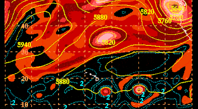
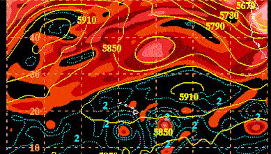
Weather that occurs at the surface is also reflected much higher up in the atmosphere. That is, weather events that take place at the surface are the result of things occurring at all levels of the atmosphere, not just those closest to the ground. By examining charts that depict weather at other elevations, one can assess the validity of the surface forecast. 500 millibar charts are useful because they depict the interaction of weather events occurring about half way up into the atmosphere (at 18,000 ft/5600 meters), or sandwiched in between the highest and lowest levels. Reading 500 mb forecasts is a bit different than reading surface charts though. Rather than using isobars to define pressure difference, these charts use elevation (in meters) to describe the height at which 500 mb pressure is located. Low pressure systems cause the 500 mb level to be fall, forming troughs in the upper air flow. Typical 500 mb low pressure elevations could reach down to 4700 meters. Conversly, high pressure at the surface is manifest aloft by the 500 mb level being high, creating sort of a 'bubble'. Typical 500 mb high pressure elevations are 6000 meters. Air at the 500 mb level flows into the troughs and around the bubbles, much like a stream flowing into holes and around rocks. The 500 mb chart then is like a topographic map of the middle atmosphere. The closer together lines of equal elevation are, the steeper the topography, and the more pronounced the features at the surface. If the 500 mb pattern looks like 'waves', then the pattern at the surface will be marked by the passage of stronger storms. If the pattern is 'straight', then a zonal pattern is set in, and surface storms are more moderate and move rapidly from west to east. Use these charts to expand your knowledge, forecasting skill and to validate surface forecasts.
 |
 |
500 mb Charts
A rather calm pattern; A weak low (5649 meters) in the upper image (upper right) and a high at 5940 over on the left hand side of the image. In the lower image (12 hours later) the upper low has moved out of the image and the upper high is moving eastward.
Image Courtesy: University of Hawaii/SOEST
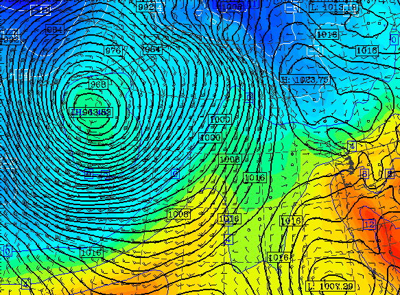
We've discussed using models for predicting storms and confirming their formation to know whether a swell has been generated. For this, we've used macro level models, those that depict weather across large areas of the earth's surface (MRF, NGP, AVN). But another need of surf forecasters is to predict what local winds will be when a swell arrives. This is a bit more tricky though, in that local topography can have a tremendous impact on wind. The big models will work depending on the location of the shore one is predicting, but not always. On the big models, a single surface wind barb might be used to depict wind conditions for hundreds of square miles of coastline. We need a much more detailed instrument, one that provides a higher concentration of wind barbs, like one for every 20 square miles of coastline. This is where the ETA, RUC, MM-5, and MAPS models come into play. They depict local conditions far more accurately. The hard part is getting access to them. Depending on continent, local model availability is either very limited or non-existent, especially for remote locations. If the models are available, use them like any other model. Otherwise, you're going to have to develop local wind forecasts the hard way, by building experience comparing the macro level models with observed surface conditions over time.
 |
Local Winds
Though a large storm rages at sea, rather calm conditions are present on the west coast of the US and Canada (far right). Wind barbs indicate winds at only 10 kts, blowing mainly offshore.
Image Courtesy: University of Washington
NEXT